Problematic Pitch Decks And Solutions to Solve Them

Not one of us is immune. It's just too easy. We need a crutch. After all, the stakes are high when you stand up in front of a group to pitch your passion.
Judging Your Pitch Deck
I once had the honor to be a part of a tech entrepreneur incubator pitch competition. Since I had previously taught public speaking for college students, I was chosen to be a judge of the competition. There were a number of great business business ideas. The concepts covered various sectors of society from nonprofits encouraging growing your own food, to a new vegan makeup line, an app to enhance communication and a new real estate platform.
During the competition, however, it didn't matter if you had the best concept... it mattered how well you could communicate it. Were you persuasive? Were you likable? Did you entertain therefore appeal to our emotions? As I listened and made notes for feedback. I remember thinking, I wish I could have helped them develop their pitch before this point.
Many had technical and financial knowledge with lots of data but there was no story. That made their pitch hard to follow. Sure, they had the data, which is important for business but there was no glue to tie it together. I could see and feel that the audience (not just the judges) were getting lost in a sea of information because there was no hook to reel us in.
Next time you stand up in front of a group, don't make this mistake... don't leave out the story. And if you tell one, be sure it's tight and maps to your goal. Here are a few tips to help you do just that.
The Number One Solution to Solve Problematic Pitch Decks: Stories
Not only is it important to use stories within your pitch but you can organize your whole slide deck as a story itself. According to the authors of Everyday Business Storytelling: Create, Simplify, and Adapt A Visual Narrative for Any Audience, there are a few major elements to organize your pitch deck as a story. This rings true for us at UpLevel as it's much like the scriptwriting we do for our clients who want to stand out with story-form animated explainer videos.
These key elements include:
- The Setting - Where does the story take place? Help the listener visualize.
- The Characters - Who are the key people in the story? Helpful hint: You are not the hero... your ideal client is.
- Conflict - What happens? What's the major problem?
- Resolution - What's your solution? How does your idea, business, etc solve their major challenge?
- BIG IDEA - What's the ONE thing you want them to remember? Since they definitely won't remember everything.
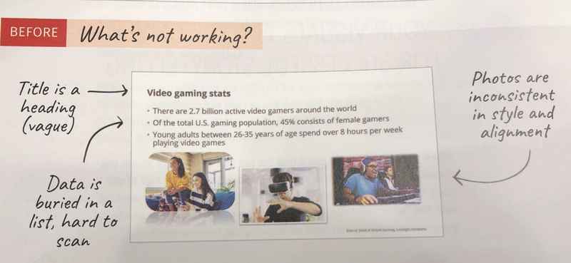
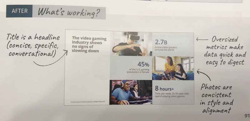
The authors of this book provide some great visuals to show how to create a deck with story in mind. Visuals speak volumes, so here are a few screenshots from their book which illustrate how to do go from cluttered to crushing it with pitch decks.


The authors of this book also apply the story concept to things like crafting an email and building one pagers for key decision makers which can help you stand out!
How to Fix Your PowerPoint Problems
We've likely ALL fallen victim to creating messy PowerPoint slides. Why else would David Phillips' 2014 TedTalk entitled "How to avoid death by PowerPoint" have 4.2 million views on YouTube?
I'm just as guilty as the next person who was under the pressure of a deadline or nervous about a great opportunity. In fact, I know I have committed this sin! I once gave a virtual talk to over 100 corporate employees from across the globe. On the day I delivered the talk, I thought my PowerPoint was great! I had carefully researched the topic, created it with a pretty template and rehearsed. Only after the gig was over did I look back and reevaluate. I included way too much information. Upon reflection I know I was trying to prove that I had "the goods," so I overdelivered.
Organizing your message is not an easy task -- especially when you like the subject you are talking about.
If you haven't yet seen the TedTalk from Phillips, he provides the following five design principles to help us level up next time we open PowerPoint.
- One message per slide - We can only remember one thing at a time.
- Use PowerPoint as it's intended - The visuals and text should work together to enhance the message.
- Big Wins - Make the most important part the biggest on each slide.
- Contrast - Use light and dark to focus attention. Dark backgrounds are better than light!
- Objects - Group them and don't use more than six at a time.
OUT with Problematic PowerPoints and IN with Persuasive Pitches!
Neuroscientist Dr. John Medina was quoted as saying, "If companies would have as little respect for business as they do for presentations, the majority would go bankrupt." Once you've gained the all-important opportunity to stand up in front of a group - be it at a staff meeting, a pitch for funding, your keynote or another setting -- don't bankrupt yourself!
If you want to be successful, you have no choice but to use those precious moments to convey a message with impact. An excellent way to do that... tell a story, in story form. HINT: A video can help ensure you are actually using a story with the power to move people into action! Check out UpLevelYourVideo.com for more information.

0 comments
Leave a comment
Please log in or register to post a comment